Modelling - 2012
Siyantika Glory
Where does this description live? Testing, testing, one two three.
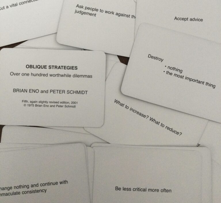
Oblique Strategies, (subtitled Over One Hundred Worthwhile Dilemmas,) is a deck of cards, each offering a challenging constraint meant to encourage lateral thinking and break any type of writer’s block. It came from two parallel projects. In 1970, Peter Schmidt made “The Thoughts Behind the Thoughts,” a box of 55 sentences. In 1974, Eno handwrote similar prompts on bamboo cards and named them Oblique Strategies. The two combined their work in late 1974. The cards were never meant to be consulted for the “right” answer. Eno’s introduction to the 2001 edition says to draw a single card from the shuffled pack when a dilemma arises and trust it even if its relevance is unclear. The best-known use was Eno’s work on David Bowie’s Berlin albums, Low, “Heroes”, and Lodger.
The physical deck has gone through several editions:
The cards are copyrighted by Eno and Schmidt. Gregory Taylor’s history page notes the copyright, and his site is widely cited as the authoritative record of every card’s text. (GREGORY TAYLOR, WIKIPEDIA)
The most complete list of the cards is Gregory Taylor’s “The More-Or-Less Complete and True History of the Oblique Strategies” (1995): http://music.hyperreal.org/artists/brian_eno/osfaq2.html
It transcribes every card in the first three editions (1975, 1978, and 1979) and shows how they changed between editions, as well as sorts them into the core set that appears in all three, cards unique to each edition, and cards that were reworded, dropped, or restored. (It doesn’t cover the 1996, 2001, or 2013 editions.)
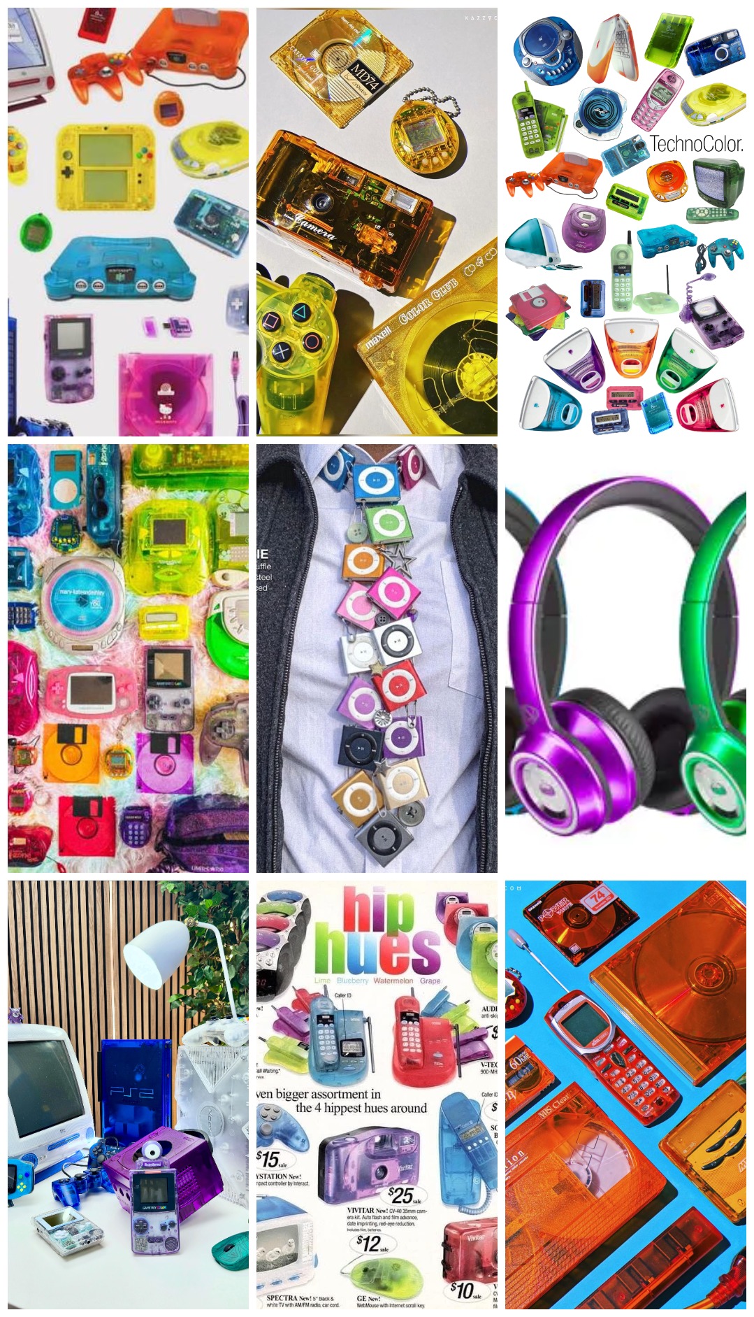
The Blobject: Instead of the sterile, sealed-shut metal rectangles of modern tech, the Foblique intends to brings back the tactile optimism of late-90s/Y2K industrial design, when technology felt playful, transparent, and inherently creative.
Housed in a chunky, translucent candy-colored shell borrowed from the Dawn of the Personal Computer, the Foblique is a deliberate nod to the transitional period when tech was moving from businesses into the personal realm, as the design aesthetic was originally born of several overlapping ideas that the Foblique aligns with, paramount among them was to make computers approachable and friendly. Transparancy and bright, fruity colors (ex. Bondi Blue, Tangerine, Grape, Lime) signaled that a computer could be personal, playful, and for everyone, not just office workers or hobbyists.
As Steven Holt writes in Blobjects & Beyond: the new fluidity of design (2005), “The blobject serves as the ideal visual representation of our increasingly fluid and changing culture. […] The fluidity inherent in the blobject implies change, dynamism, communication, and progress, and thus gives us cause to hope.”
Also, because Y2K translucent tech was made of a durable, high-impact polycarbonate, it presented like it would easily survive being thrown into a backpack or dropped on a floor. This further invites users to grab and shake the Foblique without being precious about it.
The Shake: Shaking is a gesture of frustration, but not exclusively. We shake our tools when using spray-paint, a Magic 8-Ball, or dice, for example. Art, fortune-telling, and chance, all in one gesture.
In this case, it is also an externalization of an internal cognitive dissonance: The user is physically shaking the device the way they might want to shake some sense into their own brain.
The Watchface: To earn a place in someone’s daily carry, an object needs a mundane, everyday utility. If it only dealt Oblique Strategies, people would be less likely to carry it.
Time and lateral thinking also have an interesting tension. The pocket watch rose alongside railway timetables and factory shifts, as an instrument for keeping people on schedule. It measures linear (read: productive) time, like deadlines or appointments, while an Oblique Strategy card exists specifically to interrupt linear thought. By housing both in the same small object, the two make each other more interesting. Checking the time becomes an invitation to change how you are spending it.
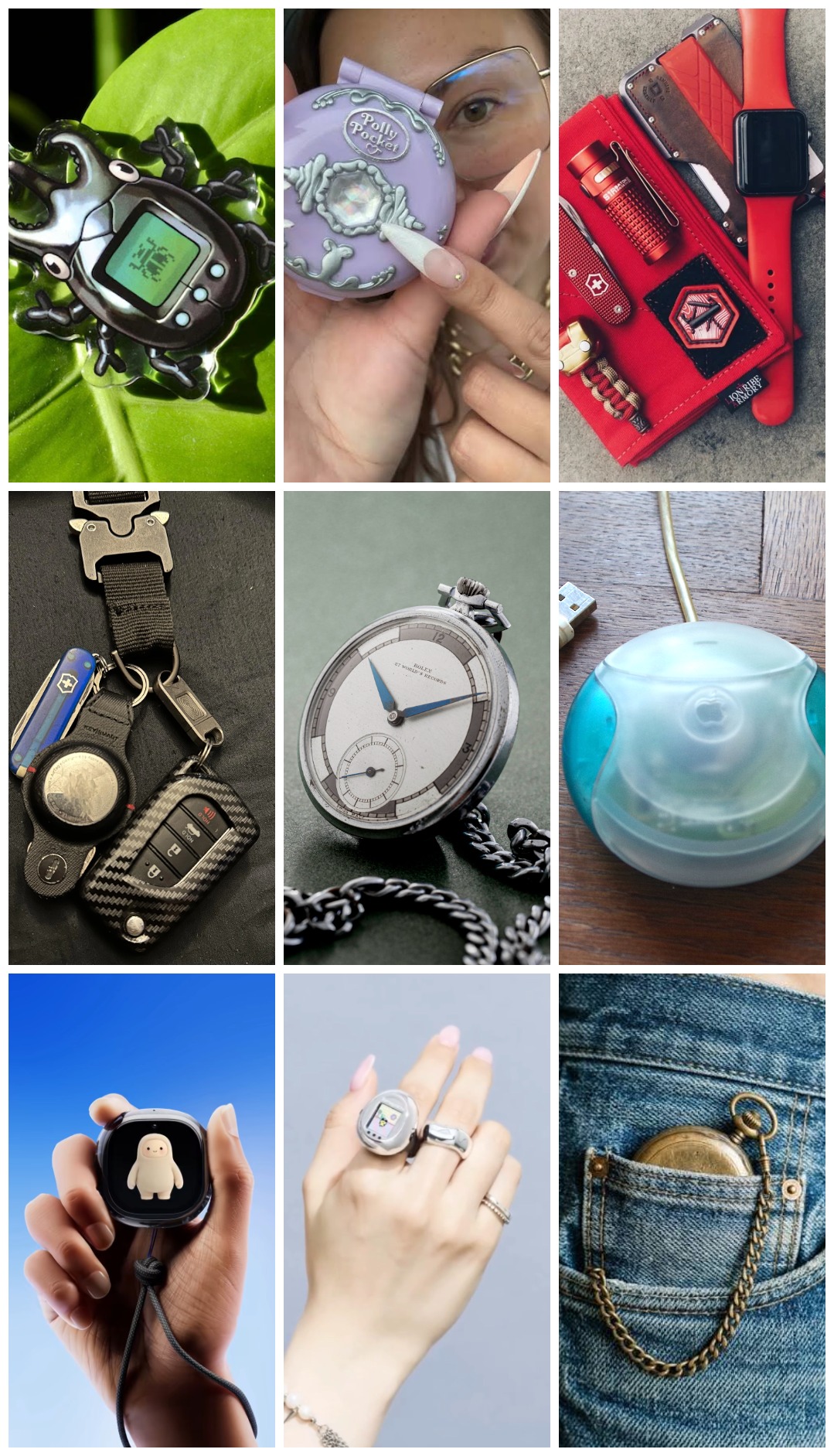
The Shape: The Foblique’s silhouette borrows from a family of small, rounded objects designed for a hand to wrap around, with no sharp coprners, like the Tamagotchi, the iMac “hockey puck” mouse, or Polly Pocket. The final shape, yet to be dtermined, will borrows from this lineage and feel bulbous, smooth, and inherently comfortable to hold.
At the top will be some type of bail, determined by research, bail at the top takes a chain, lanyard, or carabiner, so it can live in a pocket, on a belt loop, or clipped to a backpack strap.
Drawing a Card: The Foblique shrinks the original deck down to pocket size and puts it behind a gesture you already know. Shake it and it wakes and draws a random card. Because not every prompt fits every moment, the Foblique doesn’t pretend otherwise: if the card misses, shake again. The next card is only a flick of the wrist away.
Keeping a Card: When the right card shows up, leave it on the screen to work alongside it, bookmark it for later, or send it to a nearby device so it follows you out of your pocket and into your project. The Foblique deals the cards, but you decide which ones stay.
The Reset: When you’re done with a card, a different gesture ends the experience and the clock comes back.
Waking and dismissing are separate actions, and further research will determine what’s best. (ex. swipe the card away, put the device face down, press a button on the screen, etc.). After the cards are dismissed, it goes back to being a watch and then to sleep.
The processing layer dictates how the device manages memory, interfaces with sensors, and conserves power between interactions.
A pocket-sized artifact requires an interface that feels intentional rather than like a repurposed smart band or watch screen.
The input layer replaces physical buttons with motion and touch to maintain an uninterrupted, organic exterior form.
Because the device lives in a pocket or bag without a desktop dock, power architecture determines how often it must be tethered.
The internal structure that holds these pieces together before the shell is closed.
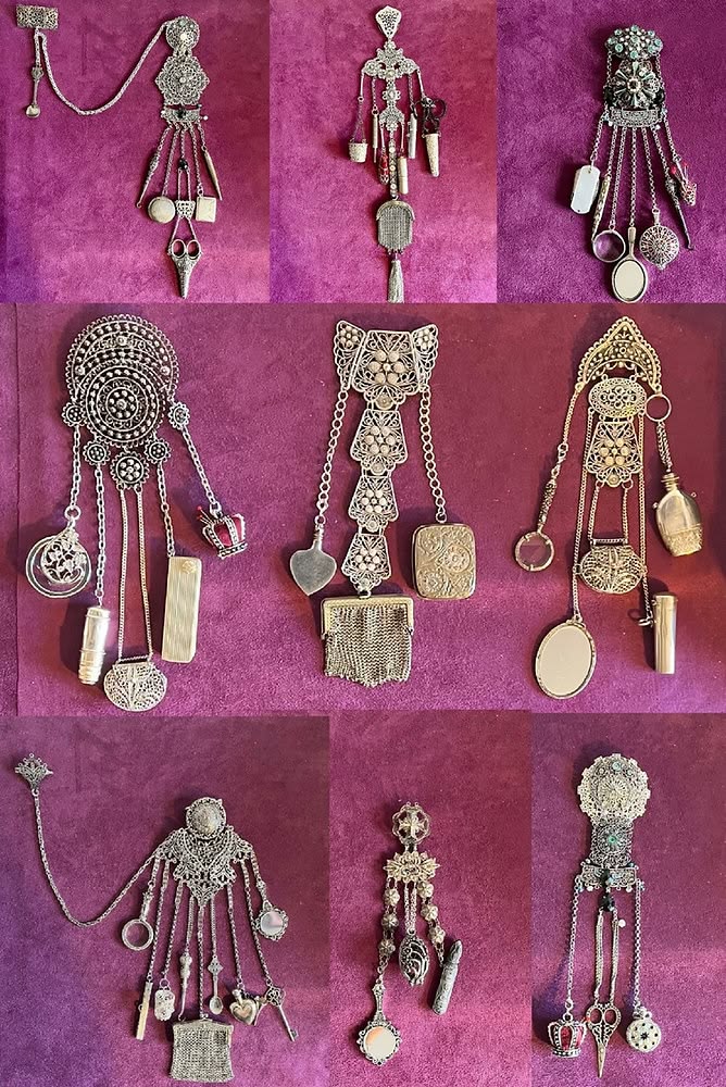
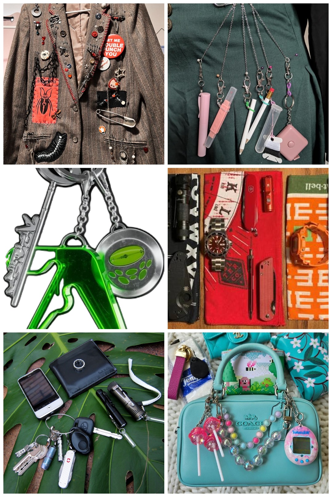
The Pre-Pocket Era: People have always carried what they needed on their bodies. Because most historical clothing lacked functional pockets, people used to wear them as heavy, kinetic jewelry, hung from a belt. (Chatelaine fittings turn up in early medieval graves, and the earliest versions held daily necessities like keys, a tobacco container, and a sheathed knife.) The Victorians later tied this type of accessory to women’s household authority, but the underlying idea, that what you need should hang within reach of your hand, never belonged to one gender. In many cases, as with estate managers, openly wearing tools and keys was a literal display of access and power.
Post-War (Post-WWI to the 1990s): The chatelaine eventually vanished due to the standardization of the pocket. By the end of the First World War, tailoring had evolved, and the wristwatch had fully replaced the pocket watch. Tools were compressed so they could be hidden away. Instead of a belt suspending six different objects, tools like the Swiss Army Knife housed them all in one handle. For most of the 20th century, everyday utility was meant to be invisible; tucked out of sight in suit coats, denim pockets, and handbags.
Y2K, Tech as an Accessory: In the late 90s and early 2000s, tools became highly visible again. This era saw an explosion of experimental, expressive hardware design. Phones flipped, swiveled and featured unique asymmetrical geometries. Because these early devices were seen as extensions of identity rather than just appliances, hardware designers began including lanyard loops molded directly into the plastic. People wore their technology. Alongside visible beepers, they dangled digital pets, USB drives, and charms off their devices, or clipped them directly to their backpacks and belts. It was the era of the Tamagotchi. Tech had become an integral part of the Every Day Carry.
The Modern Revival: Then, the smartphone arrived. It absorbed the camera, the map, the watch, and the notebook, trapping an entire chatelaine’s worth of tools behind a single rectangle of black glass. Hardware design became a uniform monolith. Yet, as a direct reaction to this sterile digitalization, the physical chatelaine returned. Recontextualized for the modern era, they are found everywhere, clipped to keychains, backpacks, waistbands, and belt loops as statement pieces. Along with small toys, like Labubu or other plushies, people are once again dangling their daily necessities—AirPods cases, keys, lip gloss, and small tools—in plain sight. It is a modern reclamation of the oldest rule of carry: if a tool matters to you, it shouldn’t just be functional, it should be immediately at hand.
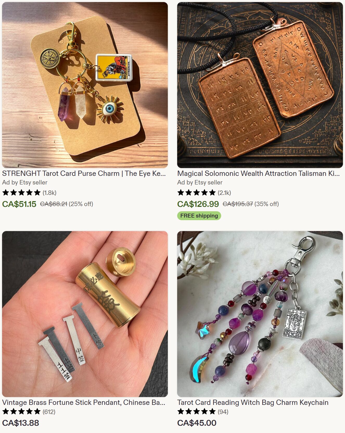
This section surveys products that, like Oblique Strategies, give a person a prompt, constraint, or random input to get past a creative block or change how they think. It covers lateral-thinking and design decks, domain-specific decks, random-input tools, and the tarot and oracle deck market that sits next to them. Each entry ends with linked source labels.
Rory’s Story Cubes. Nine dice carrying 54 images, designed by Rory O’Connor. The cube version launched in 2005 through Kadon Enterprises, and Gamewright’s 2010 US release at $7.99 was reported as its best first-year seller. A current retailer lists the classic set at about $18. Used for storytelling, writing prompts, and unblocking, with expansions sold separately. THE OUTPOST GIFTS & DECOR AS DES JEUX RAINBOW RESOURCE
Tarot and oracle decks are the largest established market for drawing a card to reflect on a situation. Published estimates of its size vary widely: US$243.1 million for 2025 from Metastat Insights, about US$485 million for 2024 from Data Horizzon, about US$0.65 billion for 2025 from Business Research Insights, and US$1.9 billion for 2024 from Verified Market Reports. Projected annual growth ranges from about 3 percent to 8.5 percent. Several sources describe oracle decks as the fastest-growing segment. A retailer’s industry report claims 14.3 percent unit-sales growth for oracle decks in 2025 and typical independent-publisher prices of $22 to $45, with premium boxed sets above $65 (retailer claims, unverified). METASTAT DATA HORIZZON BUSINESS RESEARCH INSIGHTS VERIFIED MARKET REPORTS TECHNAVIO DECKAURA


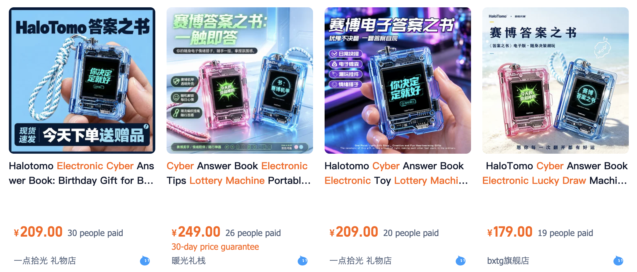

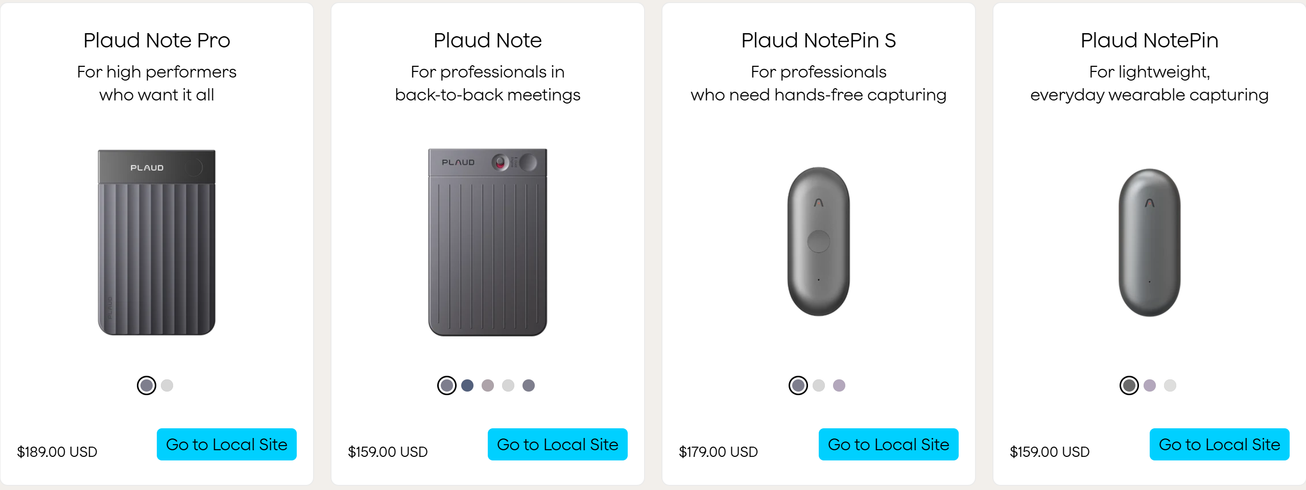
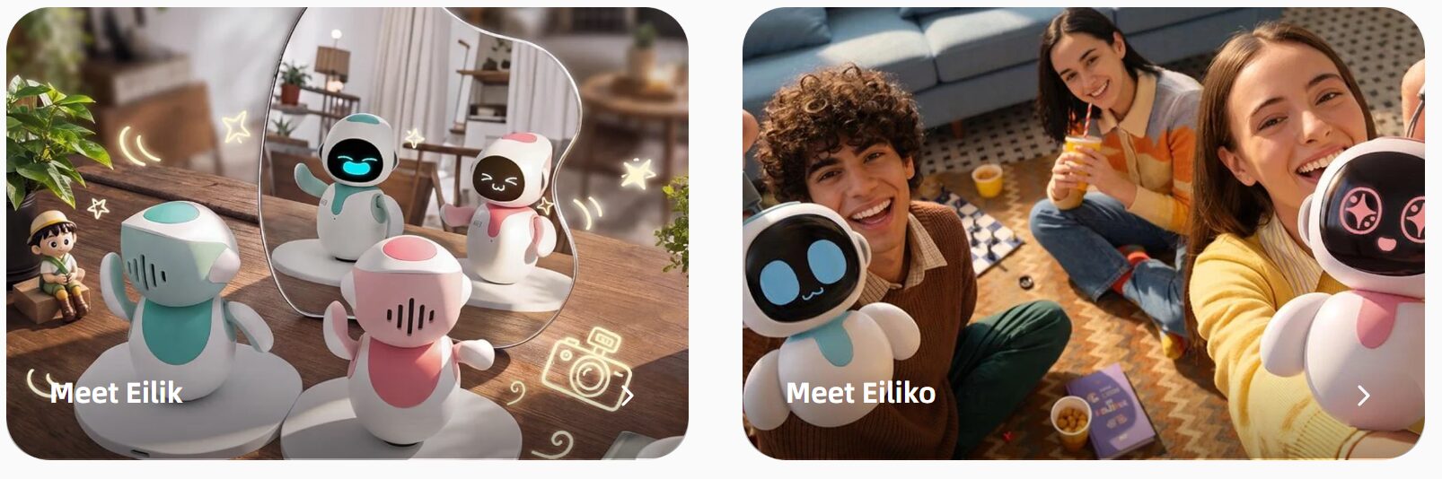
Kickstarter campaigns show demand for products that are not yet on sale, and how some products now on sale began. Totals are campaign pledges, not sales.
Audience Nostalgia, Y2K aesthetics, and “kidult” buyers show up repeatedly (Tamagotchi, Labubu, Halotomo, Pokémon GO Plus +).